Most Popular Articles


 Photo by Brett Jordan from Pexels How to Select the Best Font for Your Business Logo DesignThe font of your logo will communicate more than just the name of your company. Fonts help in communicating a sense of personality and style of a brand, directly impacting consumers’ emotions and thoughts. Like colors, fonts also convey different meanings. Bold font can stir up feelings of confidence, power, and strength, whereas a clean font is associated with a sense of tradition, simplicity, and timelessness. Before you choose the right letterform for your logotype, it’s worth learning about different types of fonts and their rules for designing a logo design. A well-chosen font can emphasize the benefits of your brand and logo, while an inappropriate selection may undermine trust and evoke unpleasant associations. With that being said, we have created this post to guide you through the font selection process for your business logo. Let's jump right into it. #1 Prioritize your Font's Legibility When designing a logo, legibility should always be considered. There are several different elements that go into creating a clear, readable logo that will create awareness of your brand identity. There should be a balance between the text, color scheme, and design that are unique to your brand. A lot goes into play when determining the legibility of the font. To start with, color combinations are imperative. You will find it hard to read light-colored text on a light background. Therefore, you should choose colors that create contrast but also matches well with the tone of your website. Apart from color selection, you need to focus on the style of the text. For example, heavily scripted fonts are extremely difficult to read. There should be spaces between each text. Nevertheless, if you choose to go with a scripted font, please note that such texts need a lot of spacing around them. So, increase the space between the line height and letters. Most importantly, when using a script style, avoid using all-caps - it is a big NO. Finally, before you move further, review the visual hierarchy to determine the space, color, size, and alignment of the logo. You can create different prototypes of a few select styles and try to get a feel of how it will look in different settings (website, letterhead, business card, email, etc.). #2 Pair Thin Fonts with Monogram or SymbolIn case if you are going with a thin text, it may not create the feel until you pair it with a monogram or a symbol. As minimal and elegant thin fonts can be, they don't usually show up in print and don't look great on social media when you scale the logo down into the profile image. This is why you should always combine the text with a symbol or a monogram. That way, when your thin font doesn't show up on specific backgrounds, you have the option to use your symbol or monogram. Thin fonts look great on dark backgrounds and are ideal for websites and other digital assets, particularly when there is enough space for them to be large. So, you cannot take the risk. What if people don't understand your logo? Therefore, go with a monogram or any symbol that resonates with your brand. #3 Detailed Logo Fonts are a Big NoDifferent fonts have different personalities. While this uniqueness will make your brand stand out, it will be harder to interpret and understand for people who are unfamiliar with the font. For example, when you use styles like Romantique, Leafy, Exotica that are extremely detailed, you will find it hard to place the logo on different backgrounds. Because you will be using the logo on different platforms like on all digital assets (websites, social media profiles, email signature, etc.), prints, etc., you will be adjusting the logo's size and dimensions for the perfect fit. So, when you use a detailed logo, it will look congested on certain platforms. Smaller assets like letterheads, profile photos, and favicons won't show off the detail in the font, causing it to lose its personality. The worst part is that using such a font will decrease the legibility of your logo. #4 Use Different Fonts No, we are not telling you to use multiple fonts to type your brand name. But use different fonts for your company name, company slogan, and other components. Slogans tell a lot about your company and brand, and you would want to communicate it with your consumers. However, never use the same text style that you use for the company name to type the slogan as well. Use a different style that complements the primary logo. Take your time to pair different fonts with each to finalize the design. Like most logo designers, you can use the hit and trial method and pair the primary logo font with a multitude of other fonts to determine which pairs the best. The secondary font you choose should achieve contrast, visual hierarchy, balance, readability, and interest in your branding. The following are the most popular font pairings that many businesses use:
Try to use these fonts in the mix and see how it comes out. But you are always free to research and mix-match your fonts to come up with a unique combination. A word of caution though. Old laptops tend to run on old OS which do not support updated software and fonts. So, you may not be able to explore different fonts that come with new laptops with updated operating systems. #5 Don't Rely on Color Many logo designs rely on color to communicate the message and brand voice, but a legible logo should be the one that is able to stand out even in its black and white version. This is where choosing the right text style comes in handy. You would want your logo to communicate your brand's personality even without color. This design option is not only memorable but will enable you to make your logo uncluttered. When it comes to font choice, the color should be secondary. Final Words These are some tips to consider when choosing a font for your logo design. Every business and brand has its unique identity, and the font should match that uniqueness to deliver the brand's voice and message. Guest Author Alicia RotherAlicia Rother is a freelance content strategist who works with small businesses and startups to boost their brand reach through creative content design and write-ups. Her area of expertise include digital marketing, infographics, branding, and graphic design. For service inquiries you can connect with her here.
2 Comments
 Photo by Jonathan Borba from Pexels Strategic Planning for Food Industry MarketingGood food has the power to weaken anyone at the knees, but the restaurant game has always been a competitive one. The harsh reality is that getting in the mouths of even the hungriest of foodies requires more than stellar dishes. A 360-degree marketing strategy is necessary to capture eaters' attention in a highly competitive space, and the following strategies can help restaurateurs understand how to attract those who will enjoy their cuisine. Founding, Sourcing, & Food StoriesOne of the only things that makes diving into a great plate of food even more remarkable is accompanying it with a great story. Sharing your restaurant’s story of how it came to be, what inspired your dishes, and the talent that brings food to life will engage your current and future diners. The connection between food and sustainability is growing more and more important to consumers, and having positive sourcing stories will attract a more diverse set of eaters to your establishment. Partnering with local suppliers and growers, using organic products, or supporting and supporting fair trade overseas is an effective way to connect social responsibility with your food. The result: your guests will feel that they are making the world a better place just by eating at your restaurant. Build a FollowingHaving a well-defined digital footprint is a critical part of staying in the top tier in the food industry. Social media is a great way to build a following and connect with fans, customers, influencers, and followers. Great food pictures are a good place to start, but keep in mind that the digital world is full of possibilities. Live-streamed cooking shows, a recommended cocktail of the week, and behind-the-scenes sneak peeks are all lively options that will keep customers coming back. Restaurant owners and chefs should make sure to build a personal following and talk about plans for any new dishes, announce new menu items and capture great everyday food moments in the kitchen. A live streamed secret recipe reveal event is also a great way to build the buzz about your food and culinary talent. How the Pandemic Changed the Restaurant BizThe restaurant industry was one of the hardest-hit industries that suffered the most from the coronavirus pandemic. Eateries were forced to depend on food delivery services and evolve their marketing approaches overnight just to stay afloat. One of the many innovative ideas that quickly grew in popularity is the at-home meal kit.
Restaurants began to package do-it-yourself kits for their most popular menu items, and diners ate the idea up. In addition, more dynamic social media posts and creating FREE and low-cost pricing for frontline workers and seniors helped to push the food industry past the worst of the pandemic and through to the other side. -- Quest Author: Abigail Baker is a writer from Happy Writers, Co. in partnership with safety manual providers, Advance Online.  Photo by Artem Podrez from Pexels Best Practices for Business GrowthIn today’s business market, trends emerge so quickly in an increasingly digital environment that it’s important to be adaptable. Successful business owners take advantage of the tools and resources available to them so that they can always monitor market shifts and situate their business practices in ways to meet market needs.
Thinking ahead isn’t just about predicting future trends, but also about being prepared for potential pitfalls. Protecting systems, for example, against data breaches, malware attacks, and other malicious intrusions will save you money in the long run. Preparedness is also about a solid business plan, and successful companies often include practices that are easily replicable. As your business expands, such practices will make increasing office capacity or even building franchises more efficient. While business is about taking risks, your risks should be calculated and you should establish practices that keep your base business strong as you decide risks that are best for your company. With that in mind, here are some ways to build excellent business foundations.
Guest Author: Ivan Young is a writer from Happy Writers, Co. in partnership with leading stethoscope distributor Stethoscope.com  Workflow Strategies for StartupsAre you looking for ways to manage your startup without stretching the limits of your capabilities? Startups often exist in a precarious state of attempting to grow their profits within the confines of their working setup, which often consists of a relatively small team. Fear not! Today, we are here to bring you some great workflow strategies that your startup might be able to adopt. What does ‘workflow’ mean?It can cover quite a range of behaviors, but in general, a workflow refers to “an orchestrated and repeatable pattern of business activity enabled by the systematic organization of resources.” In simpler English, it means that a workflow is a repeated behavior that helps a business to achieve its goals. This could refer to anything from knowledge sharing techniques to a specific way of working. How can startups improve their workflows?There are countless ways that a startup could optimize their workflows, so let’s take a look at some of them:
Life as the leader of a startup can be complicated, so make sure that your new workflows don’t add to that complication. Consider how accessible your workflows are for new employees, and deliver something that is user-friendly. -- Guest Author: Jack Vale is a writer from Happy Writers, Co. in partnership with online faxing service, Faxage. How to Design a Great Sports Logo?Every sports fan recognizes their favorite team’s logo and colors within seconds. These two key factors help the team stand out and allow fans to quickly identify it on the field or at the league table. Designing a great sports logo takes a lot of time and effort, especially if design is not your strong suit. We hope you are not easily intimidated! Here are a few ideas for designing a logo that conveys the goal and soul of your sports team: Come Up With Some IdeasWhat will be the general theme of your sports logo? What design elements will it feature? What message will it convey, and how will it do so? You will have a better idea of where you are going with your logo design once you have answers to these questions. You should also consider things associated with your team, such as your hometown, stadium, player nicknames, and so on. Consider using your mascot as your logo if you have one. It is not illegal to draw inspiration from other logos. Find logos that ignite your curiosity and match your aesthetic preferences. Fortunately, nowadays, all you have to do is go online and type in search terms like “football team logos,” “basketball team logos,” and so on. Get inspired but do not plagiarize. While taking ideas from other designs can be helpful, plagiarizing the designs will not get you very far. I love the site Dribbble for inspiration. Consider Different OptionsIf you look real close at other designs, you will see that sports logos come in various shapes and sizes. Some logos are abstract artworks, while others feature text. It is not rare for a sports logo to incorporate both a graphic element and text. There are variances even in the text—there are simple typefaces and typefaces that jump out. Explore the various logotypes and typefaces to determine which works the best for your sports team’s identity. Make Your ChoiceYou should have a good idea of what your logo will look like and how it will deliver your team’s message to the world by this point. You must now choose the most successful logo variants that appeal to you. Make sure that those variants are:
If you cannot settle on the perfect logo design, do not let your growing frustration drive you to make rash decisions. You can always ask for input—your friend or coworker can help you decide on the best option or offer changes by looking at your shortlisted logo options. The Last WordAn innovative, compelling logo design is the best “spokesperson” for your sports team. It is a great way to get your name out there and connect with fans, sponsors, and other members of your community.
However, unless graphic design is your specialty, be prepared to put in the hard work to design a quality logo. You can also take the easy way out if you feel this job is well above your skills—contact the expert logo designers at Kickass Designs to get a sleek, memorable logo that catches the eye and stands the test of time. Connect with us on Instagram HERE  7 Actionable Strategies for Increasing Your Social Media InfluenceWith the growing number of social platforms out there, do you know where you should hang out to build your brand equity? Because it is virtually impossible to be everywhere. Pick two or three social media platforms where your existing and potential customers are most active and interact with them regularly. With that out of the way, check out my top seven actionable strategies that will help you get the most out of your branding efforts on social media: 1. Add a professional yet engaging LinkedIn headline or Facebook intro.Instead of saying you are “Self Employed” or a “Business Consultant,” tell your audience exactly what you can do for them—for example, “Marketing Strategist to Ramp Up Your Sales and Profits.” or "Personal Branding Photographer, Offering Unforgettable & Empowering Brand Photography." or "Logo designer, offering high quality, affordable, custom logo design" 2. Write a captivating summary or “About” section. Answer the question, “What do you do?” As with any marketing message, write from the perspective of your customer. So, what problems do you solve or what solutions do you offer—in other words, what results do your customers get when they work with you? For example, if you're in need of a new logo you're gonna want a logo that your clients find captivating, memorable, and professional. We at Kickass Designs can help with that. 3. Update your contact information.Make sure you add the same phone number, complete address if you have a storefront (link to Google Maps), and a website link to all your platforms. You don’t want your customers driving around the city looking for your store. Similarly, you don’t want them to arrive at your closed store despite your hours being listed as “Open.” If your store hours, phone number, website, or address changes, update every listing you have immediately so they are all the same. This will help with organic traffic and seo. 4. Use the right images.When it comes to graphics, pick a professional headshot rather than a cute picture of your dog. After all, we are talking about your brand here. This could be your first impression in front of your target consumers, so make it a good one with a branded cover photo, background image, or profile picture. 5. Customize visual content.When it comes to graphic size, each social media platform has its own design guidelines, so make sure you scale/crop your visual content accordingly. There are numerous online tools that can help you resize your images for different platforms and make minor design changes with the click of a button. Hire a professional graphic designer if you want your visual content to make the biggest impact. Find hundreds of talented designers on Fiverr. 6. Create video content.Did you know that videos are three times more likely to be shared than static images? Make short videos (1-2 minutes or less) explaining a concept or providing helpful suggestions. Do not forget to add your company’s logo and a call to action. Find endless examples on TikTok. Just open the App and search your industry for ideas that have gone viral. 7. Create a social calendar. Creating a framework for each week or month takes the guesswork out of determining what to post each day and keeps you from being overly pushy. To get started, use an Excel spreadsheet to list the products and services you wish to market, as well as ideas (Motivation Mondays or Fun Fridays), blog entries, glowing customer reviews, and so on.
So there you have it: seven strategies to enhance your social media presence in 2021. If you want more branding tips for your company, read our other blog posts!  5 Personal Branding Tips For Small Business Whether you realize it or not, branding has been a large part of your life. Fact is, you make buying decisions every day based on branding and marketing. But, these concepts are no longer solely designed for big companies. With influencer marketing changing the way consumers discover, learn, and purchase goods and services, personal branding is becoming more important–regardless of whatever industry you belong to. Keep reading to learn some personal branding tips to boost your small business or brand and find your target audience. Understanding Your Personal Brand Building a personal brand is often the missing link between customers and connecting with your business. A personal brand is very similar to a traditional company brand but directed towards an individual. Personal brands also have core values, a mission statement, and even brand colors. Color Psychology in Logo Design and Branding Just remember this as your mantra: People buy from those they know, like, and trust. With social media today you are better positioned than any time in history as a small business or personal brand to show your potential customers what you're all about, that you're likeable, and you're trustworthy. And the best part is you can do this for free with the phone you already have in your hand. 1. Define Your Personal Brand Personality Ideally, your day-to-day personality and personal brand’s personality are very much alike. Still, you want to make sure you understand your personal brand’s character. It needs to come across in every social media post, article, video, and interview you share with the world. Consistency is key. There are many ways to help you find out your brand’s personality, but asking yourself these questions can also help:
2. Find Your Niche As you start to discover your brand’s personality, you’ll ultimately find its niche too. Determining your specialization, that thing you can do better than anyone else, helps you focus on your brand’s messaging. The best way to create a distinctive personal brand is by becoming the go-to, recognized authority, and expert on a specific topic. For example, I'm a logo designer in Portland but I also do photography. Within the many types of photography I'm best at shooting portraits in Portland so I have built my brand and marketing strategy to reflect that and attract those in need of portraits, instead of weddings or family photos. If you market to everyone you market to no one. 4 Reasons to Update your Logo Another example, maybe you're a graphic designer but you specialize in logo design and have no interest in designing business cards, posters, or brochures. If that's the case make sure that's crystal clear to your potential clients so you don't waste time or resources attracting the wrong clients. 3. Build Your Social Media The power of social media is undeniable, and you must capitalize on it to build your personal brand. Think of social media as the modern way to network. It isn’t just about posting beautiful photos and engaging videos anymore. You have to engage and interact with your audience. Reach out to others who share similar values or interests, follow other influencers within your niche, stay up-to-date with the latest conferences and events. These small actions will help you build a personal brand as you start to find your spot in the market. Social Media Marketing Strategies for Small Business 4. Use Visuals to Reinforce Your Brand Companies have products, storefronts, and advertising to reinforce the brand. As a small business or personal brand you can use the same concept. Use color, images, design, and other branding elements to strengthen your brand. 7 Reasons why a Logo is Important to your Brand Consider getting a custom logo, a personal brand website, or using consistent color palettes and fonts in your social media posts. These are great ways to reinforce your brand. Then, consider more subtle and traditional branding methods like having personalized checks, business cards, and pens you can hand out during meetings or presentations. A great example of personal branding is @jake.pnw on Tiktok. Jake has over 9 million followers thanks to defining a niche and brand on TikTok. All of Jake's videos are of him interacting with sea life in an entertaining way. He found what works with a very niche audience and built a very profitable brand around it. 5. Be Authentic Last but not least, be authentic. Customers are becoming savvier and savvier, and they’ll quickly call out fakes on social media. When you’re recording videos or taking photos, remember to create an emotional connection with your audience. When it comes to personal brands, well-designed videos with high production won’t cut it any more. Customers want real-life interactions that show the true you. The explosion of TikTok is a perfect testament to that. Have anything to add? I'd love to hear from you in the comments below.
 10 Social Media Marketing Strategies That Work There's no way around it. It's time to stop avoiding the inevitable. If you own a small business you will have to invest ample amounts of time or money into social media marketing, and for good reason, as I write this there are over 4 billion active social media users. That's literally twice as many users as there were just five years ago and they aren't going anywhere. The average user spends at least 2 hours on social media platforms every single day. So why wouldn't you leverage that time spent on social media by your potential clients to build brand awareness, develop customer relationships, and even make sales directly within social platforms. In today's fast paced economy it is critical for your success and survival. Social media seems to be in constant evolution. This is why spending time developing the right social media marketing strategies for your business is so important. While this might seem daunting, following these tips will help you set up your social media for success. 1. Set Goals That Make Sense for Your Business Most people focus on followers when they think of social media, but your goals should go far beyond followers. Some businesses use their social media to build a community, while others want followers that convert and drive more revenue. The goals for those businesses will be different. And, sometimes you might even need to have different social media accounts to track other goals. Take, for example, dog backpack retailer K9sportsack. Their main account (@k9sportsack), focuses on their products and branding. Their community-based account @k9sportsackcommunity shares photos of their community, funny memes and has a more community-based outline and goals. 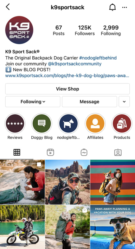 Here are some social media goals to consider for your business:
2. Leverage the Power of Trends Sure, not all trends will be relevant to your business. That doesn’t mean you can’t see the bigger picture and leverage the power of trends on your social media accounts. In this day in age if your business isn’t creating video content you’re losing a huge opportunity for exposure, reach, and engagement. Specifically with TikTok, no DSLR camera required. Make sure you’re investing time and effort in short-format videos, Reels, or TikTok videos to connect with your audience. All of this can be done with the cellphone you already own. How to use Pinterest to triple your website traffic Danny Wang Design is a perfect example of how small businesses are leveraging social media platforms like TikTok and seeing huge returns. DW Design is just your average pool, landscape, and interior design firm with over a million followers consuming their incredible before-and-after and demo videos on TikTok. Founder Danny Wang includes clickbaity captions in the thumbnails for his videos (like “Lake Size Pool” or “Never Ending Construction”), and makes sure the big reveal is covered by an underwhelming “before” scene. All of the videos then cut to an over-the-top luxury design created per the client’s request. To mix it up, Wang will share time-lapse videos of an entire project as well. 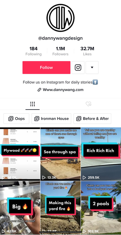 Another example is Washington-based R&A Treeservice who now has almost 600K followers on TikTok. Time-lapses of the R&A team sawing down massive trees to hip hop sounds get tens of thousands of views. While his business is limited geographically for their main service offering, R&A is now able to sell merch to fans all over the country. For small businesses like this that operate in specific regions, consider the secondary revenue streams that could come from viral fame. 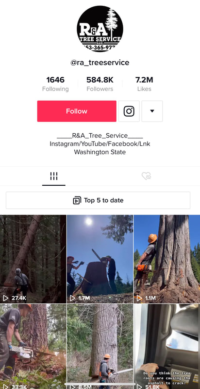 Instagram Stories are also another great way to stay in front of your audience and on their minds. Because stories are time-sensitive material (only last 24 hours), you’re tapping into customers' FOMO (fear of missing out), which is why they drive so many views and engagement. How to grow your following with Facebook Groups 3. Focus on the Right Social Media Platforms The biggest mistake small businesses make is trying to be on every social media platform on the horizon. Instead, analyze your audience and their social media behavior to help you narrow down your social media platform presence. If your audience isn’t spending time in TikTok, why bother? Instead, invest your time and money on the social media platforms that make sense to your business. Here’s a quick breakdown of demographics per social media platform:
As you can see there are simply to many social media platforms to mange on your own so I would play around with a few and find out what 3 platforms brings you the biggest return on your time investment.  4. Hire a Virtual Assistant As you can see with all the multitude of social media platforms it can get overwhelming to keep up with. This is where a Virtual Assistant comes in handy. If you have a marketing budget you can pay a VA to do pretty much any task you can think of for as little at $6 an hour. An over seas VA can not only create content for your business specific to each platform but they can also post that content for you and even respond to comments in your place. Full automation.  5. Follow your CompetitorsNo idea where to start or what to post? Check out your competitors, see who's successful and follow their lead. Analyze what they are doing that works and do that. Doesn't even have to be local. If you're a logo designer in Portland, Oregon or a photographer in New York, or a real estate agent in Miami, you can find people all over the world doing what you do and killing it on social media. What are they posting? When are they posting? What are their captions like? What are they putting in their bio? How are they interacting with their audience? 6. Go viral with Humor One time-tested social media marketing strategy is using humor. Humor marketing can be tricky, and it needs to be sensitive to what’s happening in the world at the moment. But, when used right, it has the potential to go viral. Sharing memes or creating funny quotes that relate to your audience can be pretty engaging and help boost your social media presence. How to grow your Instagram following 7. Engage with your Audience I see so many small business accounts post great content but then they never respond to comments. This is the fastest way to lose your audience unless your Kim Kardashian. Take the time to respond to every comment. 8. Collaborate with other Kickass Brands The power of collaborating with like-minded and complementary brands is undeniable and will introduce your brand to a completely new and hopefully engaged audience you may have never reached on your own. When another Instagram user discovers you through a collaboration you’ve done they are more likely to crush that follow button because odds are if they found you from a collaboration they are the demographic you’re looking for. Collaborations with complementary brands will double your organic reach and are 25 times less expensive than digital advertising! Just make sure that your collaboration is mutually beneficial and both your audiences will benefit from your collaboration.  On brand collaborations for example: Because I shoot alot of fashion it makes sense that I would collab with influencers, models, designers, and makeup artists because their audience will be similar to mine and thus mutually beneficial. 7 things I look for in a collaboration (meaning not paid). What's their following like? Whats their engagement like? Will their audience connect with my work? Will mine connect with theirs? Do we have similar values? What kind of connections do they have? How skilled are they? I try to find people and brands that have a similar or bigger following than me but will collab with someone with little to no following if they are incredibly talented. The 7 things I look for are important. If you're just collabing with anyone and everyone with no intention you will fail in your industry, miserably. So how do you find people and brands to collab with? Do your research, join local facebook groups related to your industry like Portland Models. Search local hashtags on Instagram like #portlandmodel or #portlanddesigner or portlandMUA 9. Don't Buy Followers Buying followers and joining engagement groups and Instagram pods is the quickest way to be shadow band or even having your account disabled. All of these things are against Instagram rules and guidelines but more importantly they just don’t work. It’s blatantly obvious when someone has purchased followers, I see it all the time. 100,000 followers with little to no engagement on each post makes your account worthless. You’re not fooling anyone and it’s not helping you gain clients. So stop it. Not to mention purchasing followers is a huge waste of money. 10. Keep Adjusting At last, as everything is digital, things move at a rapid pace. Remember to check your analytics, see what worked and what didn’t. Keep looking at your competitors and how your audience interacts with your posts. Then, readjust. Every month, you should carve out some time to analyze your social media efforts and adjust your content calendar for the following month. Eventually, you’ll find the secret sauce that works for your business.
Have anything to add? I'd love to hear from you in the comments below. Connect with me on Instagram. 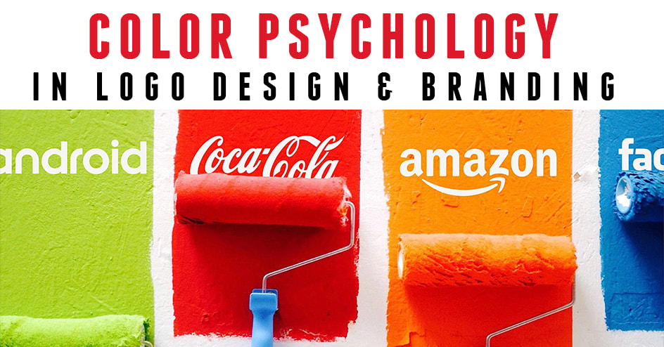 Whether you notice it or not, every color around you has a personality and strikes an emotional response in your brain. Yellow makes you feel upbeat, happy, and cheerful, green evokes serenity, healing , and quality, while purple signifies luxury and royalty. Designers understand the meaning and purpose behind colors in logos and branding but as an entrepreneur with no design background you may not know the psychology of color. Of course when hiring a designer you expect them to know all of this already but if you have a general idea of what emotions are provoked from each color you will be ahead of the game when approaching a new designer. In this article I will list 11 colors used by top brands to market their business and the emotions they provoke. So with your brand in mind let's discover what colors are right for you and your business. 1. Black provokes Power, Sophistication, & Elegance  Black symbolizes professionalism and substance. It helps make bold statements or convey a sense of authority. Black logos do well for already established brands, where there’s no need to use flashy colors to grab any attention. 2. Blue provokes Loyalty, Wisdom, & Stability  Blue logos are universally liked but not too powerful. These exhibit a sense of assurance. Most tech brands like Facebook or Twitter favor blue because it represents trustworthiness, intelligence, calmness, & loyalty. From baby blue to navy blue this color is sure to have your brand taken seriously. 3. Brown provokes Rugged, Trustworthy, & Dependable  Although brown is the less utilized color in logo design, different shades of brown are often used in the legal, construction, coffee, & outdoor industries. If you’re wanting to portray an earthy, rugged, or warm feeling, brown is your best friend. 4. Green provokes Tranquility, Organic, Quality  Green suggests relaxation, healing, growth, healthy, nature, organic or money. Above all, it indicates that the brand is environmentally-friendly. It’s great for companies that strive for ethical and organic practices or are into finances. 5. Gray provokes Practicality, Timelessness, & Classic  It’s a pretty neutral shade and is ideally used as a secondary color for brands to portray a classic and timeless appeal. Lighter shades of gray seem more accessible, and darker ones add mystery to the brand. 6. Orange provokes Energy, Playfulness, & Change  Orange is refreshing and helps you stand out from the crowd. But only a correct combination can evoke the right feelings as orange can be both enthusiastic or aggressive. It’s an excellent choice for brands that aren’t too serious but confident. 7. Pink provokes Compassion, Femininity, & love 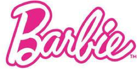 Pink is usually associated with brand logos that are more female-oriented or linked to sweetness, fun, beauty, fashion, and physical sexuality. It’s soothing, nurturing, and feels both modern and luxurious. 8. Purple provokes Authenticity, Luxury, & Success  Want to appear wise, cutting-edge, and royal? Use purple. Your imagination is the only barrier when it comes to purple. If you're a luxury brand purple and gold are the perfect color combination. 9. Red provokes Confidence, Energy, & Intensity  Red evokes urgency, appetite, and intense emotions. It’s a universally utilized color to grab more attention. Go for red if your brand is loud, modern, youthful, and playful. 10. Yellow provokes Happiness, Warmth, & Cheer  The classic smiley emoji is yellow, but danger signs are yellow too. Yellow conveys a sense of happiness while grabbing attention. It radiates youthful energy, affordability, and accessibility. 11. White provokes Clean, Simplicity, & Innocence  White renders clean and sophisticated logos. So if exclusivity, goodness, and luxury are your brand traits, try white with other colors like red to evoke a feeling of excellence. 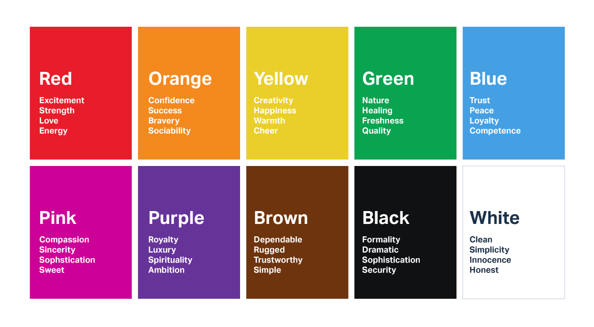 Look, design trends are always changing and ever evolving but the use of colors and the emotions they evoke will never change. Choosing the right color for your brand is far more important than simply going with your favorite color. Your favorite colors may be red and purple but as you can see those 2 colors wouldn't convey the right message if your marketing to customers looking for something organic, healthy, or nature related. I hope this article helped. I would love to hear from you in the comments below. See our work HERE 7 Reasons Why a Logo Is Important to Your Brand 4 Reasons to Update Your Logo  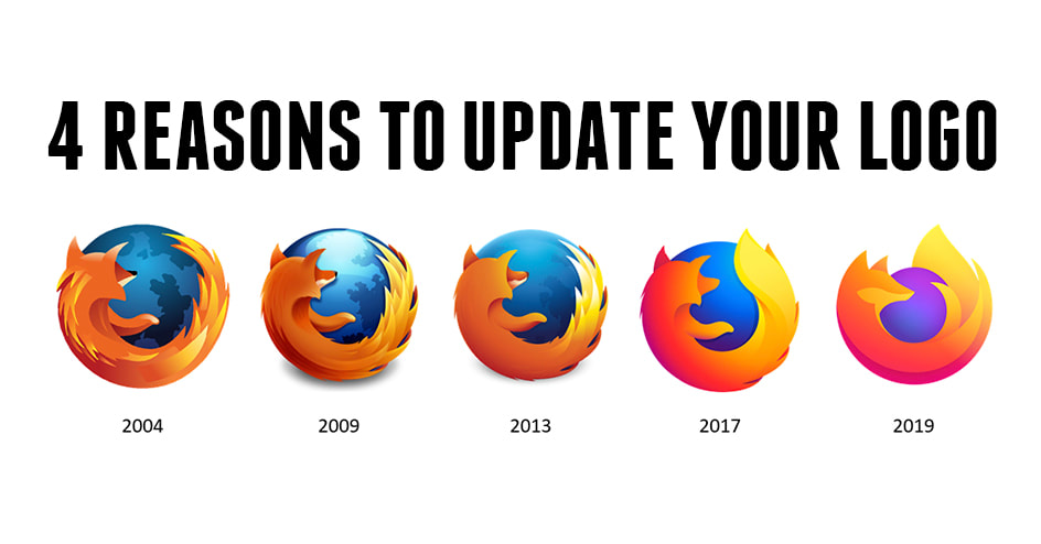 Are you one of those entrepreneurs who thinks that their business will do just fine with an old outdated logo? If so, then you probably aren't paying attention to big companies like Nike, Pepsi, Google, Firefox, Ford, Apple, Starbucks, Burger King, IKEA, etc. who have all updated their logos over time. A logo is much more than just your business name on a sign out front of your business. Not only does it go on your business cards, flyers, letters, website, merchandise, and all of your business documents, but it also serves a greater purpose. It is essentially the face of your business. And if you don’t have a visually appealing, updated, memorable logo, you're most likely losing business to your competitors. Below are 4 of my top reasons why you should update your logo in 2020 or 2021. 1. It makes you look more professional. If you get your logo updated for nothing else, at least update it so that you look more professional to your customers. I mean just look at the difference between the first google logo and the most recent google logo. Without a quality logo, a company seems like a new startup that does not have everything working for them yet. Look, we've all been there, when we start a new company or brand we are bleeding cash. We try our best to get everything done as cheap as we can just so we can open the doors. Price is more important than quality to a lot of people starting a business and let's face it, we all have a cousin who's "in school for graphic design" who will design a logo for cheap if not for free. However, with a custom, well done, professionally-designed logo, from an experienced, seasoned designer like the ones we have here at Kickass Designs you're sure to get an updated logo that customers will connect with and know immediately that you are a well-established and credible company. 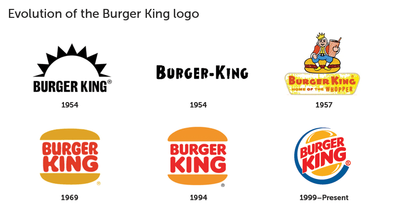 2. It makes you stand out. In the fast paced economy we live in today it's important to remember you don’t operate alone, meaning there are competitors who are seeking to attract and retain the same clients you are. It's more important now than ever to stand out. Now is your chance to reposition your brand, so you don't get over looked or left behind. Just look how much more the current IKEA logo stands out than the 1954 version. A well done professionally-designed logo will help you stand out from the crowd and outshine your competitors. The first impression lasts, and a high-quality and visually appealing logo can make sure you have get the first impression right. 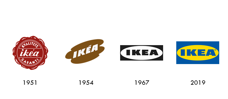 3. It makes your brand memorable. One of the best parts of getting a custom well-designed logo is that it will help your customers remember your company. Just look at Barbie, we all remember the logo and the pink colors when we hear the name. To be successful, a company has to build and retain its customers and without an effective memorable logo this is almost impossible. I'd bet on my life that I could name any well known brand like Instagram for example and you could probably picture their logo in your mind. If your current logo doesn't seem memorable, now may be the perfect time for a facelift from one of our seasoned designers. 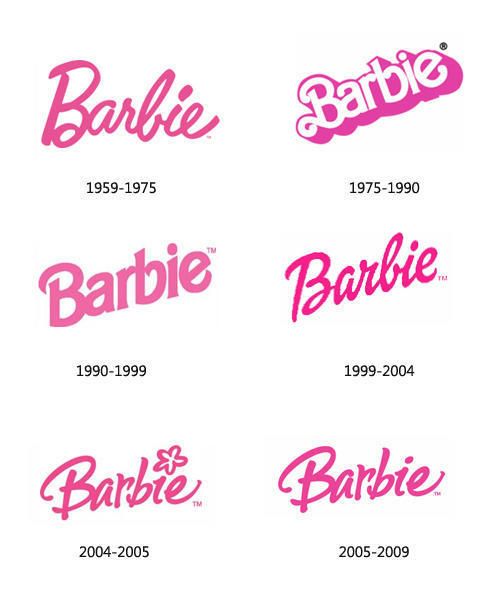 4. It is one of the core elements of branding. Another great reason to update your logo is to start branding your company again. There will come a time when your old logo simply isn’t accurately branding your business anymore. Every business evolves, and so should every logo. If designed professionally and properly, not only will your updated logo become the new face of your business, but it will also become associated with your exceptional products and services. And isn’t that what a great branding strategy is all about? Shell has done this numerous times over the years. Now is the time to assess your current logo (ask yourself, Is it professional? Does it draw my attention? Would it attract a customer’s eye? Is it memorable?) and consider new logo design ideas. Think about what your business does and its mission statement and how you might convey it in a logo. If you feel under-qualified to design a logo, there are plenty of companies out there like ours willing to do it for you. Logo designers can walk you through the process and help you develop the perfect design to convey your message. Remember, in order to best represent your company to the outside world, it is important to have a logo that evolves with your business. Hire a professional designer that can create a logo that is adaptable to ensure long-lasting success. And if you're reading this and maybe haven't started your business yet and you're in the early stages, here's 7 more reasons why a logo is so important to your brand. Make sure to connect with me on Instagram HERE  |

AuthorLance Reis CEO of Kickass Designs Archives
November 2021
Categories |
 RSS Feed