Most Popular Articles

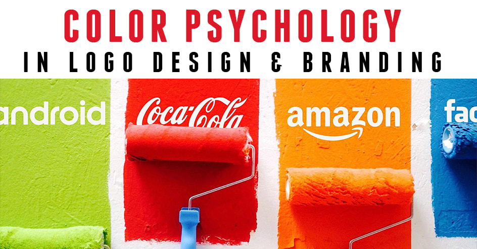 Whether you notice it or not, every color around you has a personality and strikes an emotional response in your brain. Yellow makes you feel upbeat, happy, and cheerful, green evokes serenity, healing , and quality, while purple signifies luxury and royalty. Designers understand the meaning and purpose behind colors in logos and branding but as an entrepreneur with no design background you may not know the psychology of color. Of course when hiring a designer you expect them to know all of this already but if you have a general idea of what emotions are provoked from each color you will be ahead of the game when approaching a new designer. In this article I will list 11 colors used by top brands to market their business and the emotions they provoke. So with your brand in mind let's discover what colors are right for you and your business. 1. Black provokes Power, Sophistication, & Elegance  Black symbolizes professionalism and substance. It helps make bold statements or convey a sense of authority. Black logos do well for already established brands, where there’s no need to use flashy colors to grab any attention. 2. Blue provokes Loyalty, Wisdom, & Stability  Blue logos are universally liked but not too powerful. These exhibit a sense of assurance. Most tech brands like Facebook or Twitter favor blue because it represents trustworthiness, intelligence, calmness, & loyalty. From baby blue to navy blue this color is sure to have your brand taken seriously. 3. Brown provokes Rugged, Trustworthy, & Dependable 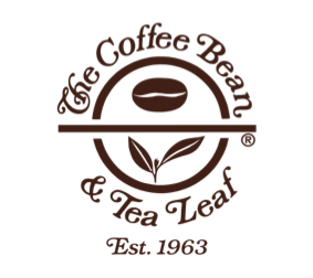 Although brown is the less utilized color in logo design, different shades of brown are often used in the legal, construction, coffee, & outdoor industries. If you’re wanting to portray an earthy, rugged, or warm feeling, brown is your best friend. 4. Green provokes Tranquility, Organic, Quality 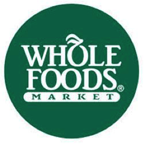 Green suggests relaxation, healing, growth, healthy, nature, organic or money. Above all, it indicates that the brand is environmentally-friendly. It’s great for companies that strive for ethical and organic practices or are into finances. 5. Gray provokes Practicality, Timelessness, & Classic  It’s a pretty neutral shade and is ideally used as a secondary color for brands to portray a classic and timeless appeal. Lighter shades of gray seem more accessible, and darker ones add mystery to the brand. 6. Orange provokes Energy, Playfulness, & Change 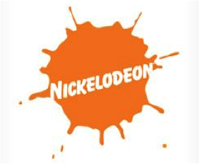 Orange is refreshing and helps you stand out from the crowd. But only a correct combination can evoke the right feelings as orange can be both enthusiastic or aggressive. It’s an excellent choice for brands that aren’t too serious but confident. 7. Pink provokes Compassion, Femininity, & love 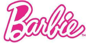 Pink is usually associated with brand logos that are more female-oriented or linked to sweetness, fun, beauty, fashion, and physical sexuality. It’s soothing, nurturing, and feels both modern and luxurious. 8. Purple provokes Authenticity, Luxury, & Success 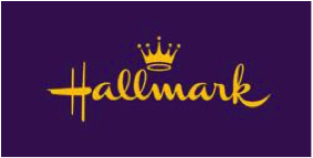 Want to appear wise, cutting-edge, and royal? Use purple. Your imagination is the only barrier when it comes to purple. If you're a luxury brand purple and gold are the perfect color combination. 9. Red provokes Confidence, Energy, & Intensity 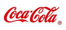 Red evokes urgency, appetite, and intense emotions. It’s a universally utilized color to grab more attention. Go for red if your brand is loud, modern, youthful, and playful. 10. Yellow provokes Happiness, Warmth, & Cheer 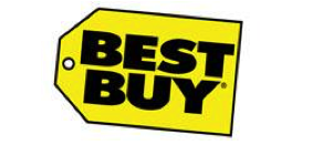 The classic smiley emoji is yellow, but danger signs are yellow too. Yellow conveys a sense of happiness while grabbing attention. It radiates youthful energy, affordability, and accessibility. 11. White provokes Clean, Simplicity, & Innocence  White renders clean and sophisticated logos. So if exclusivity, goodness, and luxury are your brand traits, try white with other colors like red to evoke a feeling of excellence. 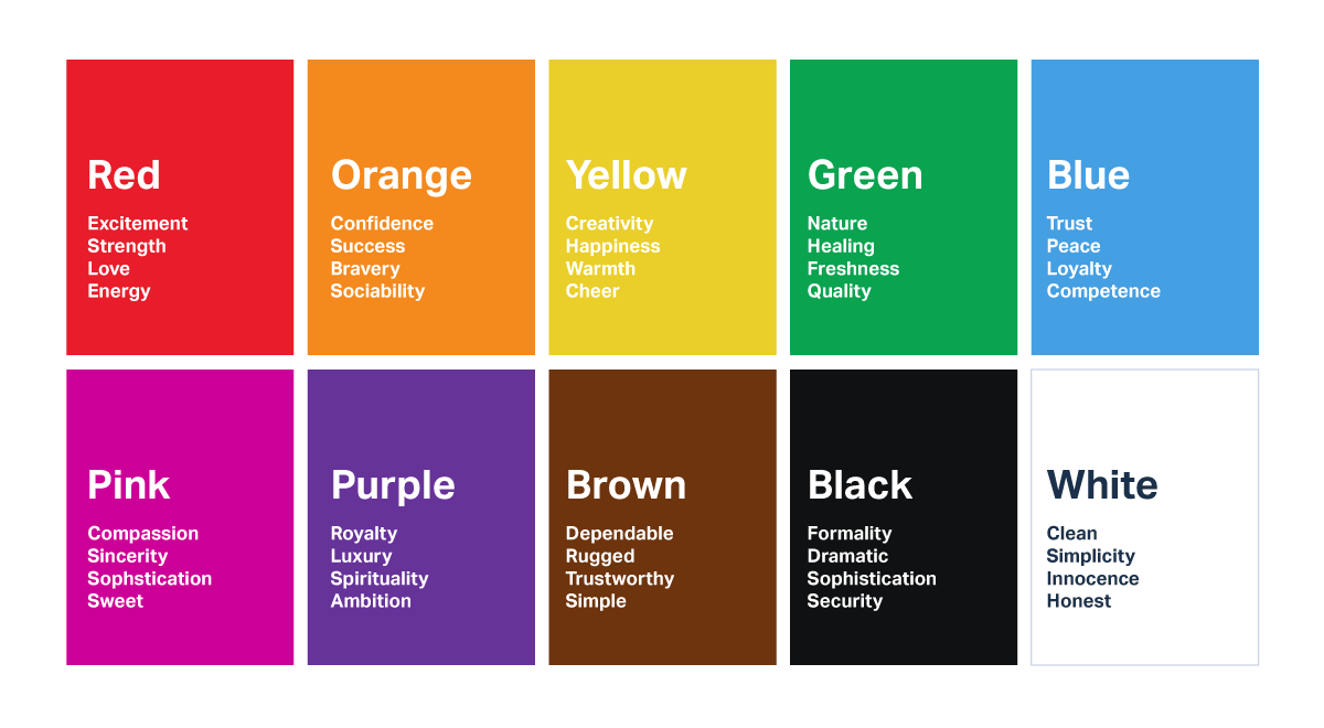 Look, design trends are always changing and ever evolving but the use of colors and the emotions they evoke will never change. Choosing the right color for your brand is far more important than simply going with your favorite color. Your favorite colors may be red and purple but as you can see those 2 colors wouldn't convey the right message if your marketing to customers looking for something organic, healthy, or nature related. I hope this article helped. I would love to hear from you in the comments below. See our work HERE 7 Reasons Why a Logo Is Important to Your Brand 4 Reasons to Update Your Logo 
0 Comments
|

AuthorLance Reis CEO of Kickass Designs Archives
November 2021
Categories |
 RSS Feed