Most Popular Articles
|
If you've ever asked yourself "do I really need a logo for my brand?" This article is for you. Every business needs branding and a logo is the most important part of your branding. Think of the infamous bitten apple representing a famous hardware and software firm or the double-tailed mermaid of the world’s largest chain of cafes or the one and only swoosh that instantly reminds you of shoes and apparel — this kind of instant recognition is the Holy Grail for any company or brand. Even though brand names are not always integrated into the design like the ones I just mentioned, most people recognize these symbols. This is why companies pay good money for their logos. Your logo is literally the face of your brand and usually the first thing people remember. If brand recognition and dominance in the industry is not enough to convince you to hire a good graphic designer here are 7 more reasons why you should consider hiring a seasoned Portland logo designer to design a great custom logo for your business: 1. It gives a great first impression. You have one chance to grab the attention of a potential buyer — make the most out of it! Hire a creative logo designer that will align your business values and interests with your brand logo. Yes, a logo is the central element of your brand. It adorns your storefront or marks most packages to pique your customers’ curiosity, prompting them to look beyond the design. A well-planned logo compels your audience to look at what more your brand has to offer. If you are selling luxury, organic, cruelty-free, premium skincare products, for example, incorporate these elements into the logo. Choose a logo to shine bright and introduce you as a specialist in the professional space. An effective simplistic modern logo will resonate with potential buyers and make them want to learn more.  2. It gives your company an identity. Your buyers brain is searching for pleasing visuals — people need an image or some visual clues (relaxing, fun, high-end, trust worthy, organic, local, or professional) to choose your brand over your competitors. Of course, the quality of your products and services is the primary determinant of your success — a logo alone cannot help you build a reputable brand. But having a distinguishable logo acts as a memory cue for people to identify your business. Great logos communicate things about your business that words cannot. So hire a custom logo design service that will match your brand identity with your mission statement.  3. It builds trust and professionalism. Ever heard the phrase “dress for the job you want, not the one you have”? Same can be said for your logo. Don't choose a logo that represents the clients you have but rather the clients you WANT. Remember, this is coming from a guy who named his company 'Kickass Designs". That coupled with my "viking" logo attracts the kind of clients I'm looking for (fun, easy going, edgy, diverse, progressive, etc.) and dissuade the kind of clients I'd like to avoid. An experienced logo designer understands that your logo goes on almost every consumer-facing merchandise or material. So, it must immediately convey what your business means to you. The more trust you can build in your potential buyers, the more success you'll have as a brand. 4. It builds the brand’s foundation. With sooooo many small and large brands trying their best to make their way up, you must leverage every opportunity to stand out and be unique. A logo is the face of every brand. It sets the stage for all other branding. (Website, business cards, letter head, flyers, packaging, etc.) While it may not be the only element of a company’s branding, it serves as its foundation. Every color, font, and graphic defines what you’re trying to convey to the audience. All these elements translate to your branding material, giving your business a solid identity. Hiring a high-quality yet affordable logo design service will empower your business to thrive and reach greater heights.  5. It is a prominent element for the brand. Our objective at Kickass Designs is to instantly connect your brand’s logo to that of your mission. Think about how you want the logo to make your buyers feel. Let’s be honest, people do forget brand names, but they immediately remember the logos. Your brain is more likely to remember a symbol before a name. So, designing a memorable graphic that also resonates with your buyers is priority number 1. This graphic goes everywhere, and the last thing you would want is potential customers not connecting to the logo on a personal level. Hiring a top-rated logo design and branding service provider will help you create a logo that attracts more buyers. 6. It sets customers’ expectations. Your logo defines your company. If the logo does not match your brands’ values, customers are sure to get confused, and confused customers are hard to retain. A logo sets their expectations about your beliefs and your operations. Believe it or not, this ingredient is the key to long term success. By not having a striking and relatable logo, you miss the opportunity to glue your brand to the customer’s mind. 7. It will be everywhere. From merchandise, website, social media, signage, marketing, to packaging, and more, your logo will be placed anywhere and everywhere to advertise your brand. It is one of the universal ways to consistently and successfully convey your brand message and that puppy is gonna be on everything.  Something I tell my clients, "your logo talks behind your back" -- make sure it's sending the right message. With so much of your success riding on how effective your branding is, it's never worth cutting corners. At Kickass Designs, we design logos that reflect your brand. From scratch, all custom. Give us a chance to help you make the most critical choice for your brand — developing the best logo possible. We are one of the best logo design services in town with hundreds of clients all over the US. Whether you want modern or vintage, corporate or edgy, elegant or whimsical, simplistic or sophisticated we can handle it all with the our personal touch and unlimited revisions means no one leaves unsatisfied. Call us at 541-760-7293 or email us for a quote today! 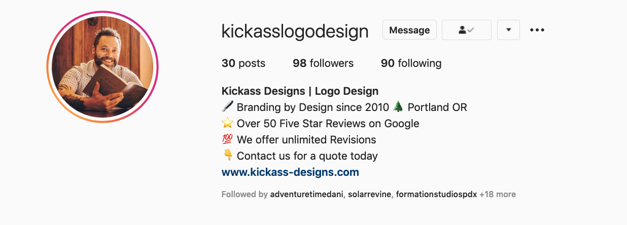 
7 Comments
|

AuthorLance Reis CEO of Kickass Designs Archives
November 2021
Categories |
 RSS Feed